While email marketing may not get the attention some newer marketing channels get, it’s still a terrific way for you to generate leads and convert more prospects for your business.Click here to download our free beginner’s guide to email marketing.
With that in mind, I want to share some email marketing best practices you can use to generate more leads for your business.
Email Marketing Best Practices
- Don’t purchase contact lists.
- Avoid using ‘No-Reply’ in the sender’s email address.
- Stick to fewer than three typefaces.
- Optimize the email’s preview text.
- Include an email signature.
- Clean your mailing list regularly.
- Keep the main message and call-to-action above the fold.
- Personalize the email greeting.
- Keep your email between 500 and 650 pixels wide.
- Split test different subject lines and calls to action.
- Include your logo.
- Name the offer in your subject line.
- Allow recipients to subscribe to your newsletter.
- Write compelling (but concise) subject lines.
- Use auto-responders for opt-ins.
- Closely tie emails to landing pages.
- Conduct a five-second test.
1. Don’t purchase contact lists.
This first tip should come as no surprise, but given the General Data Protection Regulation (GDPR), it bears repeating.
Email campaigns depend on a healthy open rate, and if you’re contacting people whose information you bought – rather than earned from a previous interaction – you’ll quickly see your emails’ performance drop.
The GDPR also requires each European recipient’s consent before you reach out to them, and purchased email lists usually do not come with that consent.
For help reaching your target audience, consider Versium Reach – a platform made for B2B marketers that allows you to own data on your target audience across multiple marketing channels.
2. Avoid using ‘No-Reply’ in the sender’s email address.
Have you heard of CAN-SPAM? This longstanding piece of legislation is a popular and important guideline for all email marketers in the U.S.
One major rule in CAN-SPAM is to never use the words “no reply,” or a similar phrase, as your email sender’s name (for example, “noreply@yourcompany.com”).
“No reply” in an email message prevents recipients from responding and even opting out of further emails, which CAN-SPAM protects their right to do so at any time.
Instead, have your automated emails come from a first name (for example, jamie@mycompany.com). Your customers are much more likely to open emails if they know they were written by a human being and it keeps you compliant with email regulations.
3. Stick to fewer than three typefaces.
The less clutter you have in your email, the more conversions you’ll get.
Don’t junk up your email with more than two fonts or typefaces, as that can distract readers and ruin your email’s visual appeal.
In addition, you want to use web-safe fonts with sizes between 10-point and 12-point. This ensures your email will be legible on all readers and devices.
4. Optimize the email’s preview text.
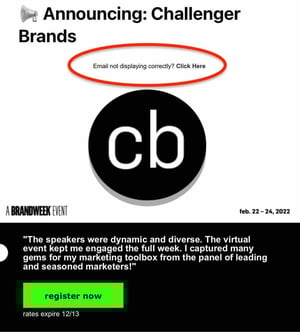
If you subscribe to a newsletter, you’ve likely seen a message like this at the top of your email: “Email not displaying correctly? Click here.”

Don’t get me wrong – it’s a helpful warning but keeping it in the preview text of your email (also known as the preheader) can drastically impact your email’s open rate.
Firstly, because you’re telling recipients, “Hey, this email might not work.” Secondly, it doesn’t provide any insight into what the email is about.
Your preview text should supplement your subject line by adding in details to capture your audience’s attention and encourage them to open.
By default, preview text pulls in the first several words of the email body and displays it next to the subject line before the person opens it.
The problem is custom email templates often stick with conditional statements like “Can’t see images?” or “Not displaying correctly?” at the top banner, allowing it to slip right into the preview when it goes out.
As a rule of thumb, always write a custom preheader that teases what your email will offer.
Pro-tip: HubSpot users can fix this problem by customizing the preview text themselves in the backend of their email marketing newsletter.
5. Include an email signature.
Even if your newsletter is technically being sent to your contacts on behalf of the company, rather than an individual, the email should include the signature of a specific person.https://www.youtube.com/embed/qWt3AH22Mh8
In a 2019 State of Business Email Marketing study, 41% of marketers said they use email signatures for branding and visibility. The second most popular reason for its use was to maintain standard, cohesive sign-offs across all their companies.
Another reason you should include your email signature is that it’s a touch of personalization. People are naturally more inclined to read an email if they know it came from a human being, not just a collective marketing team. Your email signature is your ticket to their attention.
Want a quick way to make a beautiful email signature? Use HubSpot’s Email Signature Generator. We also have an Out-of-Office Email Generator to make your response to incoming messages just as delightful.
6. Clean your mailing list regularly.
Some of your email contacts might not opt-out of your email campaign, but will still never open your emails.
It’s tempting to email as many people as possible to reach more prospects, but keeping your least-engaged recipients on your mailing list can kill your open rate. People who never open emails make your campaign look worse since you’re not analyzing the campaign’s quality against your most loyal recipients.
Review your list of subscribers who haven’t engaged with your emails over a certain period of time, and remove them on a regular basis. This gives you a more accurate email open rate and keeps your email campaign clean of the people who are no longer interested in hearing from you.
You can also implement a workflow in which they’re gradually moved to a less frequent email list based on activity.
For instance, say you have a daily newsletter. You could implement a workflow in which subscribers who do not open your email in two consecutive weeks are moved to the weekly email. Then, those subscribers could be moved to the monthly newsletter if they don’t open 4 consecutive emails. And so on.
It keeps you from bombarding your subscribers with emails they’re not interested in while keeping your list clean.
7. Keep the main message and call-to-action above the fold.
Above the fold refers to the information that’s visible to the reader before they scroll down.
Even though recent research suggests that consumers scroll more than they used to – because of social media and vertical timelines – above the fold content still gets the most attention.
Eyetracking research from Neilsen Norman Group found that consumers spend 57% of their viewing time on above-the-fold content. That number drastically goes down to 17% of the second screenful and gradually decreases as they scroll.
With this in mind, place your message and CTA above the fold. It’s the first thing your recipients will see once they open your email, therefore increasing your conversion rate.
You can also run an A/B test first to validate the hypothesis and see if it works for your emails.
8. Personalize the email greeting.
How often do you read emails that begin, “Dear Member”?
You might segment your email audiences by the type of customer they are (member, subscriber, user, etc.), but it shouldn’t be the first thing recipients see in your company messages.
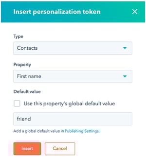
Personalizing the greeting of your emails with your contacts’ first names grabs the attention of each reader right away. For HubSpot users, this is called apersonalization token, and creating one looks like this:

Then, the address line of your email would automatically produce the contact’s first name by fetching this personalization token in the email’s HTML, like this: Hi, !
Don’t worry, personalizing an email’s greeting line with 50 recipients’ names doesn’t mean you’ll have to manually write and send 50 different emails from now on.
Many email marketing tools today allow you to configure the greeting of your email campaign so that it automatically sends with the name of the people on your contact list – so everyone is getting a personal version of the same message.
9. Keep your email around 500 to 650 pixels wide.
If your email template is wider than 650 pixels, your email won’t show up correctly and will require users to scroll horizontally to read the full email.
This is a pain, to say the least, and will likely affect your conversion.
Having your template fit within the standard format will make for easier readability, better conversions, and an overall better user experience.
10. Split test your subject lines and calls to action.
If you can’t seem to increase your email’s open and click-through rates, a couple of things might be wrong: You’re not emailing the right people (are you buying your contact list? See the first tip at the top of this blog post), or the content needs to be improved.
To start, focus on the latter, and conduct an A/B test.
A/B tests can be used to improve almost any of your digital marketing content. In an email, this test splits your recipients into two groups: Group A receives the regular newsletter, while Group B receives the newsletter with a specific variation.
This variation tests to see if your audience would be more or less likely to take an action based on that element.
HubSpot Marketing Hub users can conduct email A/B tests on anything from the subject line to the call-to-action (CTA) inside it.
For example, you might change the color of your CTA from red to green to see if your email’s clickthrough rate increases. If it does, the test indicates that you should change your emails’ CTA color to green from now on.
11. Include your logo.
Logos are a must when it comes to emails.
A 2020 study by Red Sift and Entrust found that logos positively impact email engagement as well as brand recall.
Brand recall increased by 18% after a five-second exposure when including a logo in the email. Purchase likelihood also went up by a whopping 34% in emails where logos were included.
With this in mind, add your logo to your email design to ensure that it’s always included.
12. Name the offer in your subject line.
When you include an incentive in your subject line, you can drastically increase your open rates.
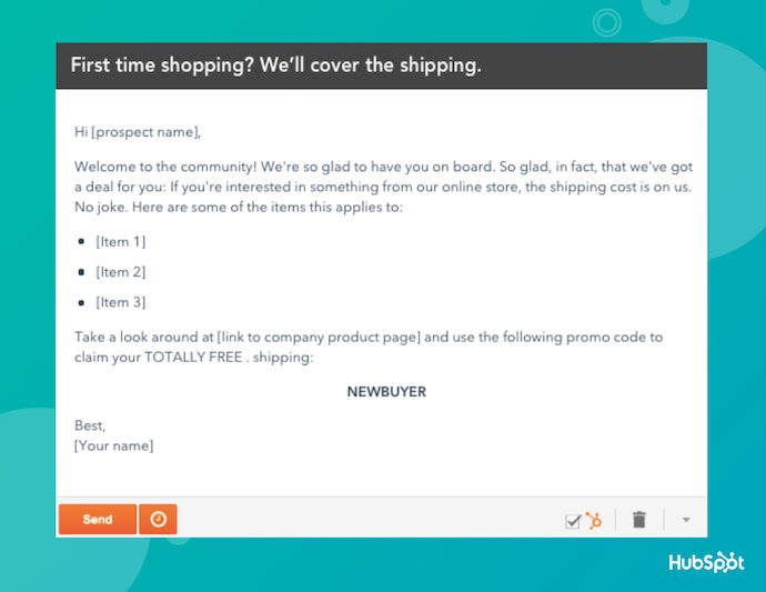
“Free shipping when you spend $25 or more” and “Receive a free iPod with a demo” are examples of good, incentive-focused subject lines.
However, be careful not to overwhelm your readers with savings- or product-related emails.
Customer loyalty starts with casual industry insights – only after nurturing should you start introducing offers. Here’s an example of an email with an enticing subject line and warm, welcoming body copy:

13. Allow recipients to subscribe to your newsletter.
You might be thinking, “Wait, if they received the email to begin with, shouldn’t they have already subscribed?“
Usually, yes, and therefore adding a “Subscribe” button to your email doesn’t help those who’ve already agreed to receive your emails. But great content is shareable content, and if your current subscribers are forwarding your emails to their friends and colleagues, you’ll want to help them subscribe, too.
Add a small but visible CTA that allows an email viewer to subscribe to the newsletter if they received this email from someone else.
But remember, because your newsletter should already be driving another action, such as downloading an ebook or becoming a community member, make sure this “Subscribe” button doesn’t distract or confuse users, weakening your main campaign goal in the process.
14. Write compelling (but concise) subject lines.
A good subject line should contain between 30 and 50 characters, including spaces. The reason why you do this is that email providers often cut off subject lines that go beyond this length.
Your email subject line should also create a sense of urgency while giving readers some indication of what to expect once they open the email.
15. Use auto-responders for opt-ins.
Be prepared for your readers to forget they opted in.
Set up an auto-responder that reminds people they opted into your email database. The auto-responder should be sent out one day, five days, and 10 days after the person registers.
Each auto-responder email should also include additional content or bonus material to reward the reader for opting into the newsletter– or your readers might not feel they have enough incentive to actually opt-in.
16. Closely tie emails to landing pages.
Your landing page should match the email in terms of headline, copy, and content. The look and feel of your landing page should also match the email as consistency goes a long way toward a customer’s trust.
Just make sure you’re using tracking tools to see which emails and landing pages performed the best so you can keep sending what’s working.
17. Conduct a five-second test.
Send a copy of the email to a friend or business associate. Can they quickly tell what your call-to-action is? If so, you’re golden. If not, keep working.
There are a lot of new tools at a marketer’s disposal that are getting attention these days. But email marketing has stood the test of time regarding its influence on your users. This old, reliable, and faithful tool can really ensure you get the most out of your marketing initiatives.
